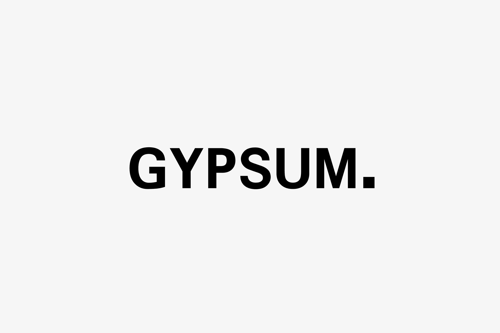
GYPSUM : branding

When we were asked to design a new logotype for Gypsum, we thought that the history was important. A family driven company, solid and compact, with a long experience in the building industry. Hence we created a font that is well balanced, that communicates calm, and then we added a “squared” dot at the end that reminds to a brick, a primary element in the construction world.

